

- Published on
Volcango Devlog 2
- Authors

- Name
- H McGill

Early Testing Reveals Turn Order Confusion
Initial test plays of Volcango were confusing and chaotic, mostly because people couldn’t figure out what to do. However, early game logic proved solid and was working. Now what we needed to do was tease out the storytelling of each thing that happens during a game. Some of that storytelling involves typography…So most people are going to find that dull but I’m the oddball who enjoys sticking letters into places where they will be legible. I’m not trapped inside the internet with you. You’re trapped in this blog with me.
We went through a lot of UI design diagnostics. My goal was to make turn order clear for different players. Who is currently choosing a move to make? Who will go after them? And, most importantly, when is it MY turn?
Researching Turn Order UI in Existing Games
 I sorted through a lot of turn-order UI options. Doing Google searches for ‘video game turn order UI’ turns up tactical roleplaying games, which commonly feature a row of character portraits that shuffle, one after another, at the top of the screen. Seen here is Divinity: Original Sin II’s wheel. This wasn’t quite what I wanted because Volcango is far from a roleplaying game.
_Problem with putting turn order UI in the top row: _ It feels invisible because the gameplay is so dominant on the lower part of this playfield. We had already solved the visibility problem of an important UI element (lava pillars) being ignored when held aloft like that.
 Our game is a board game, not a tactical RPG. I researched Mario Party games and had to resort to rewatching a Game Grumps playthrough just to see how the UI worked. Mario Party keeps its turn order UI at the bottom of the screen, and includes player stats like coin count and star count. Each player's UI container is shaped to look like an arrow, and it shuffles right-to-left along the bottom of the screen (possibly due to Japanese reading order?)
Problems with 'scrolling character portraits' or anything involving portraits: How would players perceive themselves in-game? Are they managing a team of animals, or are players actually animals? Luckily each animal species has recognizable quality to it so that makes designing its portrait simpler. I want to make sure I’m representing not only a turn order but also an interesting fantasy for the player.
 My final point of reference was Neopets Key Quest, which had lodged itself in my memory as a clean UI. Upon reflection, wow, everything Neopets does with its UI is super busy, not very clean at all. However! I do like Key Quest’s combined chatlog/gamelog box. We never incorporated a chatlog/gamelog box even though I liked it a lot. Most of this was due to the simplicity of Volcango as well as our distaste for moderating what anonymous people type into kid’s games (which will come up again later as we design the turn order UI).
Problems with 'chunky' or 'skeuomorphic' UI: It's too much! There is a lot going on visually already. Contrast is also very important for anything text-based. Something sinking into the aesthetic is harder for the player to find. See comics speech bubble styling…The best comics have the text front-and-center in spite of a comic’s style. Readers who can’t read a comic…won’t…and players who don’t understand what’s happening in a game will not play it.
Let's Get Designing!

With all of this in mind I hacked out an idea. Not the prettiest but getting started is rarely pretty. After some discussions with my partner, the aesthetics were fine for testing but not finalized.
I had a question for myself: Do we let Unity handle the 'carousel' UI effect or do I do it in Spine somehow? The answer was: Unity handles it. Well…a talented programmer makes Unity do it, after I ask him politely. And then we redesign it later anyway because the carousel doesn’t really make sense to players.
Otherwise I was feeling good-ish about this.
 As for the turn order 'carousel' idea, we didn’t commit to it, although I gave it my best shot with some polish.
After experimenting with the concept, we flipped it and have it point right-to-left at the player, who has now been positioned on the bottom left instead of the bottom right. The volcano skooched over to the right and was polished a bit, to accommodate different screen dimensions. Of the changes we made during this UI revision, the volcano’s placement and the player being on the left side was the only thing that stuck.
 In the meantime I had momentum and enough feedback to create the UI player rigs, who will hold and display cards for their players. I first thought that since these are animals they will not use their paws to do this, they will hold the player's cards cutely in their mouths and snouts, and duck under the screen to grab new cards when they need them. For simplicity the cards hover in front of the animals. It was not only simpler to implement, but it also makes the cards feel more like they are in the player’s hands.
So, the story for the player in this game is that they may or may not be an animal, but they are interacting with a group of animals. A fun enough fantasy. This doesn’t need to be an immersive, recently-extinct animal sim.
 We also tried out an an animated 'divider' that p'choo's across the screen with the next player who's going. The first version ran across the screen with early concept art of the animals lazily pasted into it. Also, p’choo is a highly technical term that only advanced game devs know.
 See? Even Mario Party has a p’choo.
 Later, we updated our p’choo divider as a Spine object to include animation.
 In Spine2D, attaching weighted mesh vertices to each bone allows you to stretch a small geometric graphic as long as you need it to be, with some scrunkliness but never enough to notice in play. It keeps the filesize a bit smaller because very small graphics can be resized upwards this way.
How do Players See Themselves When They Play Volcango?
 Usernames wound up being involved with the Turn Order UI, since players are represented by the animals they've chosen to play. We're intending to let people log in and play multiplayer, with some marker to indicate who they are to their friends, but we have no resources to moderate communication. A chatroom is absolutely right out; if players want to communicate we may give them some simple in-game tools to bluff or suggest where other players should put their pieces, but there will be no text-based communication at all. That's just not the kind of commitment we want to give to this game and it seems like the only viable solution to de-platform hateful stuff. We'd still like people to be able to choose usernames to represent themselves across games, but we don't want them typing in hateful or disgusting words.
 We've come up with a system where people can assign themselves a random adjective and a random paleo/animal noun from a list that we've generated (or words that I find funny that will appeal to children). I think it's funny to eventually be playing with your friends: Delightful Antelope, Raging Parakeet, and Magical Thagomizer. Players should be able to duck in and feel anonymous while having a specific handle, but not be able to affect other player's anonymity/safety.
There could have been an option that assigns an adjective to a player but the noun changes depending on whether they've chosen Dodo, Thylacine, Woolly Mammoth, or Tortoise for any given game, but we wound up not implementing that.
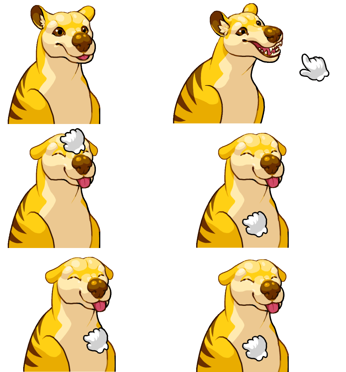
Now for player portraits. Initially my idea was to make fully articulated rigs for the Turn Order UI. I got as far as making individual rig parts for each character (awkward-looking due to T-pose), but was feeling overwhelmed by my recent experience working on the player character rigs (more on that later). I discussed the workload with my partner who suggested illustrated states instead of full rigs.
 The idea was that these characters hang out in an idle pose, then slide into a more active pose during their turn. If you pet the animals in the UI by clicking them, they lean into your pets with simple tweening animation. This is really important strategic gameplay, to pet your animals. There's no point to having a doglike critter if you can't pet it after all. This was also the kind of feature that winds up impacting everything else in the game’s development cycle. Yes, really. Too much of this game is influenced by pettable animals, so I hope players enjoy them.
 Of course immediately after talking me out of rigging these animals I got the polite request to make the tongue a physics object and I was like...well. I just didn’t know how to do that. Eventually I learned how to parent bones to specific skins in Spine2D, but it was too late for this project and I didn’t have any other special physics in mind for the other animals.

 I was expecting to spend a day per animal but I really zoomed through the tortoise and the dodo. At this point, since I had already finalized the animal designs, having everything designed beforehand really speeds up drawing these things. The only animal left is the woolly mammoth! I gave up yesterday because of her tusks...it's a graphic design nightmare, trying to get those things not to form tangents with her eye, her trunk, or the playing cards.
 Coming in on a different with fresh eyes, I was getting some jrpg/dating sim vibes from these portraits...is that a good or bad thing? Would you date these extinct beasts?? Eventually I'd love to create some sort of story-based game, especially something with a good romance subplot, and I guess this is an unexpectedly necessary learning experience. I should get the designs of the characters nailed down, animated, and edited before doing fancier things like pettable portraits.
 With the bigger animal UI portraits we had to shuffle them onto the left part of the screen, where they had more real estate. We also shrank the volcano stage and all the animal pieces on the volcano one more time, which hurt because I had already polished those graphics. I thought I would hate resizing them down more, but the net result is all the animals look smaller and more vulnerable, which is fitting for the disaster that will rain down on them.
This turn order marker marches from top to bottom, starting with whoever goes first, and with the player’s own animal always the biggest at the bottom.
Later, we also added a 'host' tag to differentiate the host player from all the other players, as well as a pop-up timer that lets a player know they're about to be timed out of the game.
One last thing: If you play this game, please, please pet the UI portraits. We put a lot of work into that, way more than I thought would happen.
Next on Volcango devlog:
A crash course in character design, or: How to speedrun learning to rig animals in Spine2D in four weeks.